Vaša košarica je prazna
Obrazovni softveri
mozaMedical
Digital complex learning materials for health sciences
To deepen and check your knowledge in health sciences, use the mozaMedical STUDENT licence. To give a presentation in a classroom or at a conference, or if you have a low-speed Internet connection, choose the mozaMedical PRESENTER licence. For institutional discounts, please contact our colleagues.
mozaMedical - Digital complex learning materials for health sciences
mozaMedical PERSONAL
Za učenike - za učenje i vježbanje
- Access to digital lessons
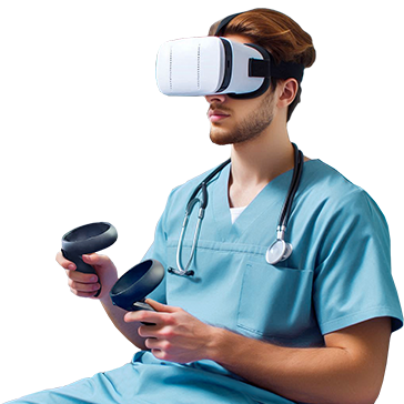
- Use of educational simulations with or without VR glasses
- Compatible with every device
XR Extended Reality
99 EUR / Korisnik
Korisnik

mozaMedical PROFESSIONAL
Za nastavnike - za poučavanje i prezentaciju
- Fascinating courses with one click
- Interactive tools for assessment
- Presentations on large displays during classes and conferences
XR Extended Reality
198 EUR / Korisnik
Korisnik
*Licenc PACK: licence kupljene u paketu PACK imaju zajednički aktivacijski kod koji vam omogućuje aktiviranje softvera na onoliko mjesta koliko licenca paket sadrži.
Korisnička licenca
Licenca povezana s korisnikom omogućuje korisniku da se prijavi na razne uređaje (računala, interaktivne ploče, prijenosna računala, tableti, mobil) koristeći svoje korisničko ime. Korisnik može koristiti i mozaBook i mozaWeb, ali može se istovremeno prijaviti na samo jedan uređaj. Ova vrsta licence preporučuje se kada korisnici rade na vlastitim računalima ili žele pristupiti platformi Mozaik na više uređaja.
Licenca na temelju uređaja
Licenca povezana s određenim uređajem omogućuje neograničenom broju korisnika pristup i upotrebu softvera na danom uređaju. U tom slučaju korisnici ne moraju imati vlastite licence. Ova se licenca preporučuje kada više nastavnika ili učenika koristi isti uređaj. U tom slučaju samo uređaj mora imati licencu bez obzira na to koliko ga nastavnika ili učenika koristi. Pravna obavijest koja se treba prihvatiti prije kupnje
Kupnjom School Admin Licenc-e potvrđujem sljedeće:
- Licencu kupujem uz izričito dopuštenje obrazovne ustanove i koristit ću je isključivo u njezino ime i u skladu s njezinim službenim svrhama.
- Potvrđujem da se nezakonito korištenje licence, posebno neovlaštena obrada osobnih podataka, smatra kaznenim djelom.
- Svjestan sam svoje kaznene odgovornosti i izjavljujem da preuzimam sve pravne i etičke odgovornosti vezane uz kupnju te da sam svjestan da će svako nezakonito ponašanje, posebno zlouporaba korisničkih podataka, imati pravne posljedice.
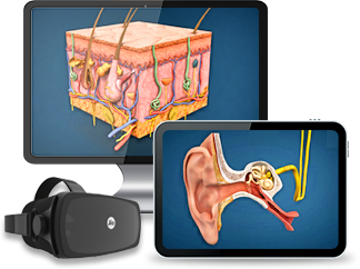
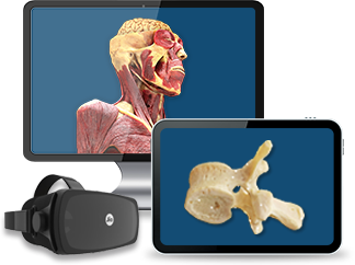
cadaVR - Digitalni atlas anatomije
cadaVR PERSONAL
Za učenike - za učenje i vježbanje
- Korisnička licenca omogućuje učeniku korištenje digitalnog anatomskog atlasa na više uređaja.
- Potpuni pristup interaktivnom sadržaju, zadacima, virtualnim funkcijama (PC VR).
XR Extended Reality
Licenc Pack*
99 EUR / Korisnik
Korisnik

cadaVR PROFESSIONAL
Za nastavnike - za poučavanje i prezentaciju
- Korisnička licenca omogućuje predavaču/liječniku korištenje digitalnog anatomskog atlasa na više uređaja, na projektoru i interaktivnoj ploči.
- Potpuni pristup interaktivnom sadržaju, zadacima, virtualnim funkcijama (PC VR).
- Brži rad, manje podatkovnog prometa - 3D modeli koji se mogu preuzeti za smanjenje podatkovnog prometa.
XR Extended Reality
Licenc Pack*
198 EUR / Korisnik
Korisnik
*Licenc PACK: licence kupljene u paketu PACK imaju zajednički aktivacijski kod koji vam omogućuje aktiviranje softvera na onoliko mjesta koliko licenca paket sadrži.
Korisnička licenca
Licenca povezana s korisnikom omogućuje korisniku da se prijavi na razne uređaje (računala, interaktivne ploče, prijenosna računala, tableti, mobil) koristeći svoje korisničko ime. Korisnik može koristiti i mozaBook i mozaWeb, ali može se istovremeno prijaviti na samo jedan uređaj. Ova vrsta licence preporučuje se kada korisnici rade na vlastitim računalima ili žele pristupiti platformi Mozaik na više uređaja.
Licenca na temelju uređaja
Licenca povezana s određenim uređajem omogućuje neograničenom broju korisnika pristup i upotrebu softvera na danom uređaju. U tom slučaju korisnici ne moraju imati vlastite licence. Ova se licenca preporučuje kada više nastavnika ili učenika koristi isti uređaj. U tom slučaju samo uređaj mora imati licencu bez obzira na to koliko ga nastavnika ili učenika koristi. Pravna obavijest koja se treba prihvatiti prije kupnje
Kupnjom School Admin Licenc-e potvrđujem sljedeće:
- Licencu kupujem uz izričito dopuštenje obrazovne ustanove i koristit ću je isključivo u njezino ime i u skladu s njezinim službenim svrhama.
- Potvrđujem da se nezakonito korištenje licence, posebno neovlaštena obrada osobnih podataka, smatra kaznenim djelom.
- Svjestan sam svoje kaznene odgovornosti i izjavljujem da preuzimam sve pravne i etičke odgovornosti vezane uz kupnju te da sam svjestan da će svako nezakonito ponašanje, posebno zlouporaba korisničkih podataka, imati pravne posljedice.
Za ustanove - Complete solution for educational institutions

INSTITUTE licence
- Pristup na razini ustanove koji omogućuje puni pristup svim nastavnicima, studentima i osoblju medicinske obrazovne ustanove, instituta za anatomiju ili medicinskog centra.
- Potpuni pristup interaktivnom sadržaju, zadacima, virtualnim funkcijama (PC VR).
- Brži rad, manje podatkovnog prometa - 3D modeli koji se mogu preuzeti za smanjenje podatkovnog prometa.
Korisnička licenca
Licenca povezana s korisnikom omogućuje korisniku da se prijavi na razne uređaje (računala, interaktivne ploče, prijenosna računala, tableti, mobil) koristeći svoje korisničko ime. Korisnik može koristiti i mozaBook i mozaWeb, ali može se istovremeno prijaviti na samo jedan uređaj. Ova vrsta licence preporučuje se kada korisnici rade na vlastitim računalima ili žele pristupiti platformi Mozaik na više uređaja.
Licenca na temelju uređaja
Licenca povezana s određenim uređajem omogućuje neograničenom broju korisnika pristup i upotrebu softvera na danom uređaju. U tom slučaju korisnici ne moraju imati vlastite licence. Ova se licenca preporučuje kada više nastavnika ili učenika koristi isti uređaj. U tom slučaju samo uređaj mora imati licencu bez obzira na to koliko ga nastavnika ili učenika koristi. Pravna obavijest koja se treba prihvatiti prije kupnje
Kupnjom School Admin Licenc-e potvrđujem sljedeće:
- Licencu kupujem uz izričito dopuštenje obrazovne ustanove i koristit ću je isključivo u njezino ime i u skladu s njezinim službenim svrhama.
- Potvrđujem da se nezakonito korištenje licence, posebno neovlaštena obrada osobnih podataka, smatra kaznenim djelom.
- Svjestan sam svoje kaznene odgovornosti i izjavljujem da preuzimam sve pravne i etičke odgovornosti vezane uz kupnju te da sam svjestan da će svako nezakonito ponašanje, posebno zlouporaba korisničkih podataka, imati pravne posljedice.
Usporedite licence - mozaMedical
| PERSONAL LICENC | PROFESSIONAL LICENCE | |
| PREPORUČENA PRODAJNA CIJENA (1 licenca / godina) | 99 EUR / Korisnik |
198 EUR / Korisnik |
| Licence PACK / godina (najmanje 10 licenci) | 89 EUR / Korisnik |
178 EUR / Korisnik |
| Licence PACK / godina (najmanje 30 licenci) | 84 EUR / Korisnik |
168 EUR / Korisnik |
| Licence PACK / godina (najmanje 100 licenci) | 79 EUR / Korisnik |
158 EUR / Korisnik |
| Vrsta pretplate | Korisnička licenca | Korisnička licenca |
| Koliko ju korisnika može koristiti? | jedna | jedna |
| Na koliko uređaja se može koristiti? | više | više |
| Dostupne funkcije | PERSONAL | PROFESSIONAL |
| Interaktivna ploča / Projektor / Veliki zaslon (veći od 30”) | ||
| Podrži uređaje virtualne stvarnost/ PC VR | ||
| Oculus Quest 2 | uskoro | uskoro |

Korisnička licenca
Licenca povezana s korisnikom omogućuje korisniku da se prijavi na razne uređaje (računala, interaktivne ploče, prijenosna računala, tableti, mobil) koristeći svoje korisničko ime. Korisnik može koristiti i mozaBook i mozaWeb, ali može se istovremeno prijaviti na samo jedan uređaj. Ova vrsta licence preporučuje se kada korisnici rade na vlastitim računalima ili žele pristupiti platformi Mozaik na više uređaja. |
||