您的購物車是空的
教學軟件
mozaMedical
数字合成学习材料,适用于医学生
为了深入学习并检查您的健康科学知识,请使用mozaMedical STUDENT许可。如果您在课堂或会议上做报告,或网络速度较慢,请选择mozaMedical PRESENTER许可。对于机构折扣,请联系我方同事。

*許可證包:包中購買的許可證擁有通一個激活碼,可以在與包中的許可證同等數量的設備上使用。
用户許可
這個用户許可允許用户使用他/她自己的用户名和密碼登錄各種設備(例如計算機、互動白板、筆記本、平板電腦或智能手機)。用户可以同時使用mozaBook和mozaWeb,但一次只能在一台設備上登錄。如果用户想在自己的多台設備上工作或希望在多個設備上訪問Mozaik平台,建議使用此類許可證。
基於設備的許可證
基於設備的許可證允許無限數量的用户訪問和使用指定設備上的軟件。 在這種情況下,用户不需要擁有自己的許可證。 當多名教師或學生使用同一設備時,建議使用此許可證。 在這種情況下,無論有多少教師或學生使用它,只需要一個許可證。 购买前需接受法律声明
通过购买学校管理许可证,我特此确认:
- 我以机构的明确授权购买许可证,并将代表机构并根据其官方目的专门使用它。
- 我承认非法使用许可证,尤其是未经授权处理个人数据,被视为刑事犯罪。
- 我意识到我的刑事责任,我声明我承担与购买相关的所有法律和道德责任,并且我意识到任何非法行为,特别是滥用用户数据,都将产生法律后果。
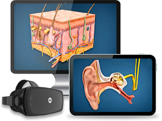
cadaVR - 數字解剖圖譜
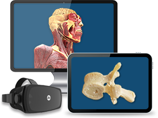
XR Extended Reality
許可證包*
99 EUR /用户
用户

cadaVR PROFESSIONAL
适用于教师 - 教学和演示
- 一種用户許可證,允許一名教師或醫生在多台設備和一台投影儀上使用數字解剖圖譜。
- 具有完全訪問互動內容、問答題和VR (PC VR)功能的權限。
- 更快的操作,更少的數據流量 - 可下載的3D模型以減少數據流量。
XR Extended Reality
許可證包*
198 EUR /用户
用户
*許可證包:包中購買的許可證擁有通一個激活碼,可以在與包中的許可證同等數量的設備上使用。
用户許可
這個用户許可允許用户使用他/她自己的用户名和密碼登錄各種設備(例如計算機、互動白板、筆記本、平板電腦或智能手機)。用户可以同時使用mozaBook和mozaWeb,但一次只能在一台設備上登錄。如果用户想在自己的多台設備上工作或希望在多個設備上訪問Mozaik平台,建議使用此類許可證。
基於設備的許可證
基於設備的許可證允許無限數量的用户訪問和使用指定設備上的軟件。 在這種情況下,用户不需要擁有自己的許可證。 當多名教師或學生使用同一設備時,建議使用此許可證。 在這種情況下,無論有多少教師或學生使用它,只需要一個許可證。 购买前需接受法律声明
通过购买学校管理许可证,我特此确认:
- 我以机构的明确授权购买许可证,并将代表机构并根据其官方目的专门使用它。
- 我承认非法使用许可证,尤其是未经授权处理个人数据,被视为刑事犯罪。
- 我意识到我的刑事责任,我声明我承担与购买相关的所有法律和道德责任,并且我意识到任何非法行为,特别是滥用用户数据,都将产生法律后果。
學校使用的 - 教育机构的完整解决方案

INSTITUTE licence
- 機構級訪問權限,允許醫學教育機構、解剖機構或醫療中心的所有學生、教職員工和工作人員完全訪問。
- 具有完全訪問互動內容、問答題和VR (PC VR)功能的權限。
- 更快的操作,更少的數據流量 - 可下載的3D模型以減少數據流量。
用户許可
這個用户許可允許用户使用他/她自己的用户名和密碼登錄各種設備(例如計算機、互動白板、筆記本、平板電腦或智能手機)。用户可以同時使用mozaBook和mozaWeb,但一次只能在一台設備上登錄。如果用户想在自己的多台設備上工作或希望在多個設備上訪問Mozaik平台,建議使用此類許可證。
基於設備的許可證
基於設備的許可證允許無限數量的用户訪問和使用指定設備上的軟件。 在這種情況下,用户不需要擁有自己的許可證。 當多名教師或學生使用同一設備時,建議使用此許可證。 在這種情況下,無論有多少教師或學生使用它,只需要一個許可證。 购买前需接受法律声明
通过购买学校管理许可证,我特此确认:
- 我以机构的明确授权购买许可证,并将代表机构并根据其官方目的专门使用它。
- 我承认非法使用许可证,尤其是未经授权处理个人数据,被视为刑事犯罪。
- 我意识到我的刑事责任,我声明我承担与购买相关的所有法律和道德责任,并且我意识到任何非法行为,特别是滥用用户数据,都将产生法律后果。
比較許可證 - mozaMedical
| 個人執照 | 專業許可證 | |
| 标价 (一個許可 / 年) | 99 EUR /用户 |
198 EUR /用户 |
| 許可證包 / 年(至少10個許可證) | 89 EUR /用户 |
178 EUR /用户 |
| 許可證包 / 年(至少30個許可證) | 84 EUR /用户 |
168 EUR /用户 |
| 許可證包 / 年(至少100個許可證) | 79 EUR /用户 |
158 EUR /用户 |
| 訂閲類型 | 用户許可 | 用户許可 |
| 有多少用户可以使用它? | 一個 | 一個 |
| 可以在多少台設備上使用它? | 多個 | 多個 |
| 可使用的功能 | PERSONAL | PROFESSIONAL |
| 互動白板/投影儀/大顯示屏(大於30寸) | ||
| 支持VR設備/PC VR | ||
| Oculus Quest2 | 即將推出 | 即將推出 |

用户許可
這個用户許可允許用户使用他/她自己的用户名和密碼登錄各種設備(例如計算機、互動白板、筆記本、平板電腦或智能手機)。用户可以同時使用mozaBook和mozaWeb,但一次只能在一台設備上登錄。如果用户想在自己的多台設備上工作或希望在多個設備上訪問Mozaik平台,建議使用此類許可證。 |
||